

Case Study
Project: End Slate Recommendations
Role: Product Design Web Lead
Platform: Web (Responsive)
Tools: Figma, Usertesting.com
Context & Problem
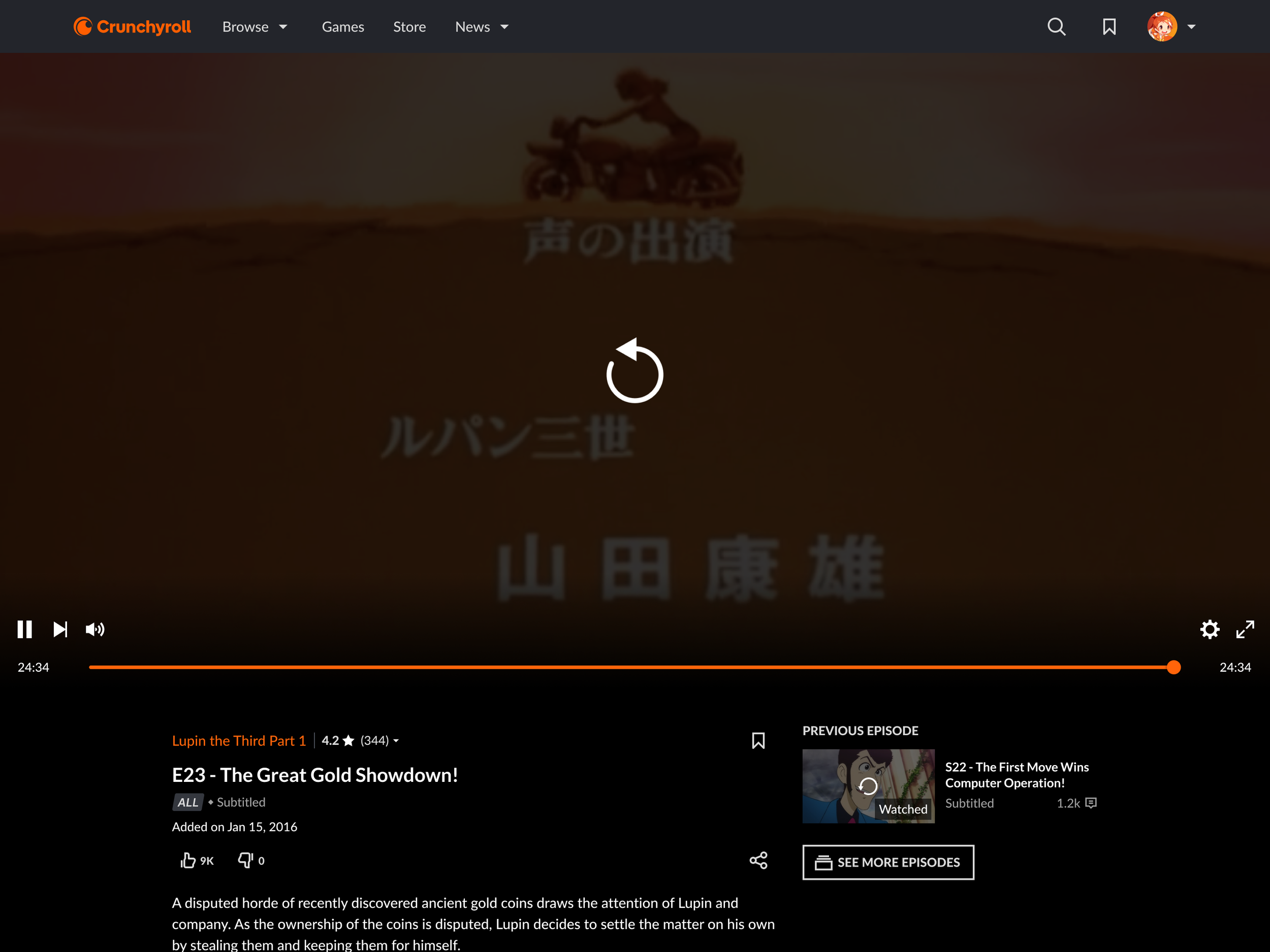
At the time, Crunchyroll’s video player automatically advanced users to the next episode—unless they had reached the final episode of a series. In those cases, playback would simply stop, offering users no meaningful next step or path forward to compelling content. This created a dead end at one of the most emotionally resonant and engagement-ready moments in the user journey.
By contrast, competitors like Netflix and Hulu were already offering targeted end-of-playback recommendations. These post-credit experiences kept users engaged and helped them discover new content without friction. Crunchyroll lacked a comparable feature—missing an opportunity to drive retention, increase watchlist activity, and provide a richer, more personalized content experience.
The Challenge
At the project’s conception, the lead PM and myself set out to create an intelligent, engaging end-slate experience that could recommend the next great series to a user, while staying true to our brand and technical constraints.
Create a compelling, non-intrusive recommendation moment after final episodes
Match or exceed industry standards in both usability and delight
Incorporate context, transparency, and user trust into every recommendation
Design flexibly for web, mobile, and living room platforms
Work within significant backend and platform limitations
Key Issues
No recommendations surfaced when a user finished a series
Users often abandoned the platform at this critical engagement point
Existing player architecture limited available interaction models
Technical constraints restricted access to richer recommendation data
Users often exited before finishing the credits
Core OKRs
Increase watchlist additions after finishing a series
Drive new series engagement post-completion
Improve user retention among those exposed to End Slate
Build a foundation for iterative discovery vector expansion
Discovery & Research
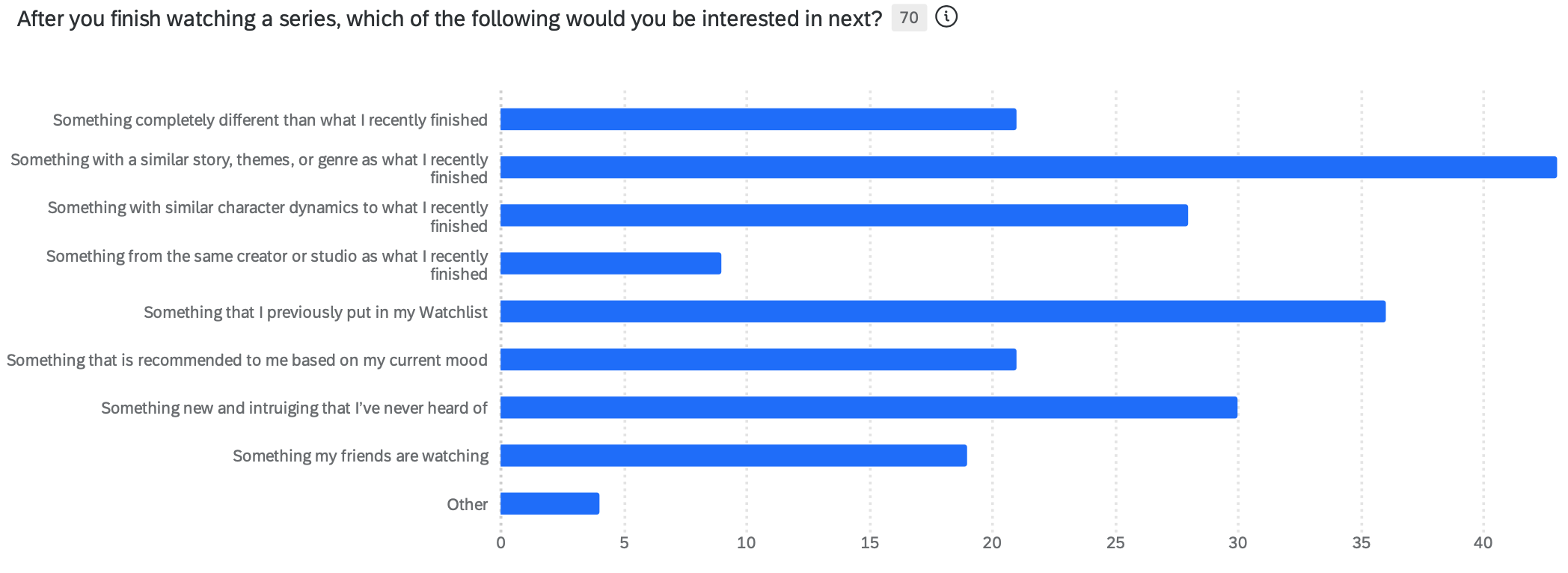
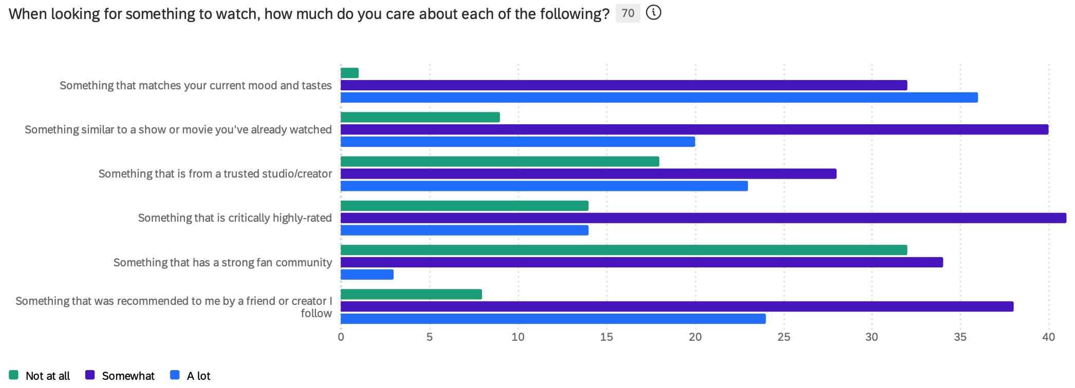
To guide the solution, I developed an in-depth user questionnaire exploring how people chose their next series after finishing one. We uncovered rich insights around trust and taste:
Users preferred human-level recommendations—from friends, influencers, or experts
They sought suggestions similar in specific, not general, ways
Many wanted transparency around why a recommendation was made
Recommendation timing was crucial—users were open to discovery after finishing a series
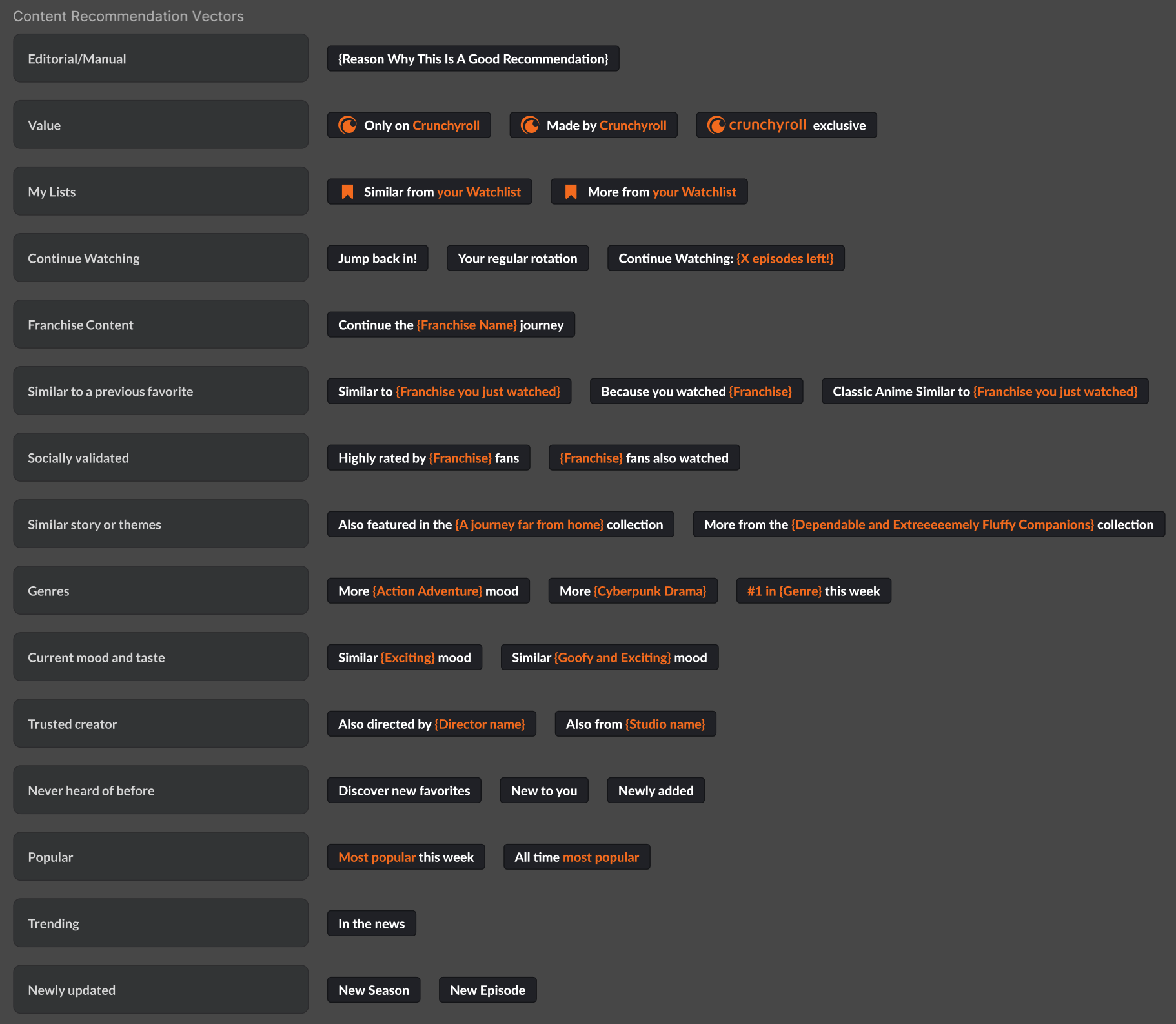
These insights formed the philosophical core of our approach: instead of simply showing “more of the same,” we’d recommend across discovery vectors—the different aspects of a show that might resonate with individual viewers.
Defining the Solution
We designed a system that would recommend new series based on distinct discovery vectors—such as genre, theme, emotional tone, creative team, or character dynamics. The user wouldn’t just see a list of similar shows—they’d understand why each one was being suggested.
Key aspects of the solution included:
Discovery Vectors: Each recommendation came with context (“Similar tone,” “Both Action and Supernatural,” “From the same studio,” etc.) to build trust and agency.
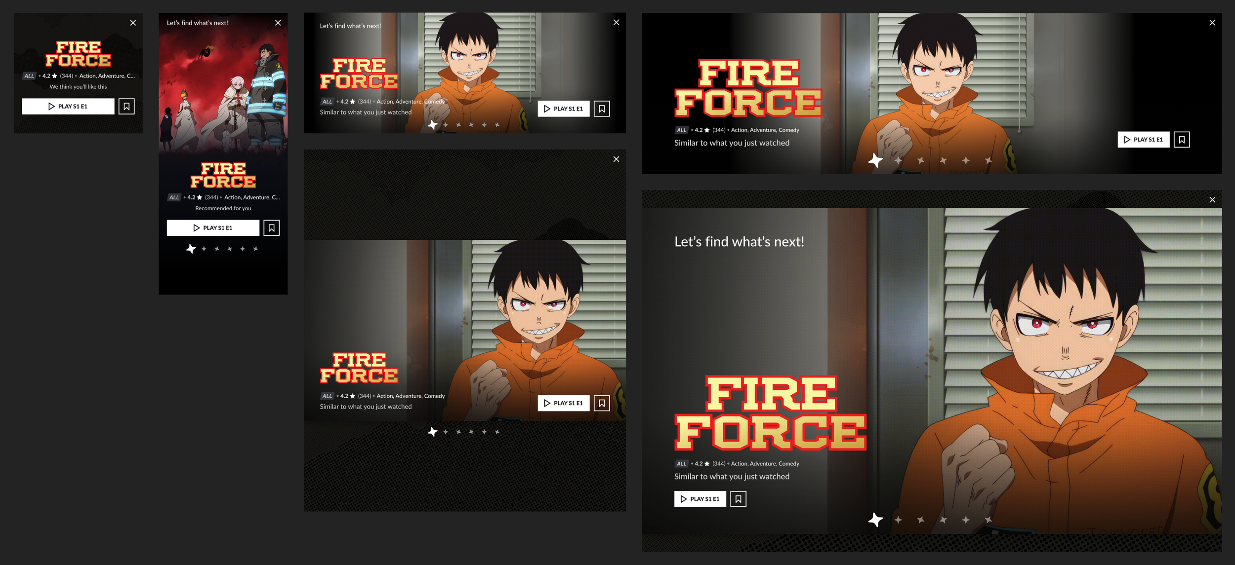
Modal Design: Due to platform limitations, we pivoted from a traditional “squeeze” overlay to a modal window triggered during credits.
Smart Timing: The modal appeared if the user specifically chose to watch the credits—allowing an opt-out experience rather than opt-in to ensure for greater audience penetration.
Cross-Platform Collaboration: As the project expanded beyond web, the project expanded to be a collaborative feature along with mobile and LRX leads to ensure responsive rules, elegant visuals, and seamless interaction patterns across devices.
Fallbacks & Fast-Follows: Due to significant technical limitations, we knew that we wouldn’t be able to launch with the full set of recommendations, so we fleshed out designs for a number of future iterations to be ready before the developers were.
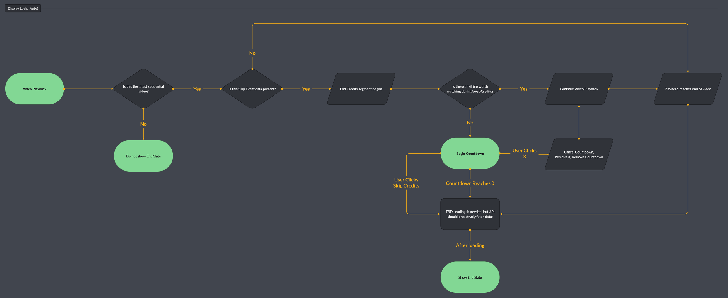
Design Execution
I began by creating foundational wireframes and product requirements with my PM, mapping out the full user flow. As the project grew cross-platform, these wireframes and flows informed the strategy and approach across all platforms. I led responsive design for web, collaborating closely with designers from mobile and LRX to ensure cohesion.
While the cross-platform design experts fleshed out the UI, we also worked with:
Our motion designer to fine-tune transitions, pacing, and moments of delight
Our content writer to define the tone of recommendation labels
Our engineering teams to align on feasibility and iterate in real-time
Significant technical limitations surfaced mid-project—including backend constraints and a lack of available recommendation data. This required creative de-scoping and reimagining our MVP.
Findings & Insights
Internal dogfooding and user testing revealed the first versions didn’t quite hit the mark. We pushed hard for polish, delaying the launch by two months to refine the UX, tighten the recommendations, and filter out already-watched content. Each iteration brought us closer to an experience that felt seamless and meaningful.
Key outcomes included:
+18% increase in new series engagement for users exposed to End Slate
+24% lift in watchlist additions post-series completion
Improved retention among users who interacted with the feature
Positive qualitative feedback around clarity, tone, and discoverability
User complaints about credit interruptions led to the design of a fast-follow setting to disable the opt-out modal
Though limited by backend capabilities, End Slate laid a strong foundation for future growth in content discovery. It also proved that with thoughtful UX, transparent recommendations, and strategic collaboration, we could elevate user trust—even within a constrained system.